The Santa Barbara Channel
A basin of oceanic data just waiting to be analyzed
The beautiful, biodiverse Santa Barbara coast is known for its pleasant mediterranean climate, gnarly swell, and unique geographic features. Among these are the four northern channel islands, Santa Cruz, Anacapa, Santa Rosa, and San Miguel, which reside between 12 and 27 miles off shore. The Santa Barbara Channel lies between these islands and the coastline, stretching from Los Angeles in the south to Pt. Conception in the north.
Ocean Currents
This channel hosts a clash of different ocean currents that causes heterogeneity in environmental conditions across the islands and circulates nutrients throughout the ocean depths in seasonal patterns.
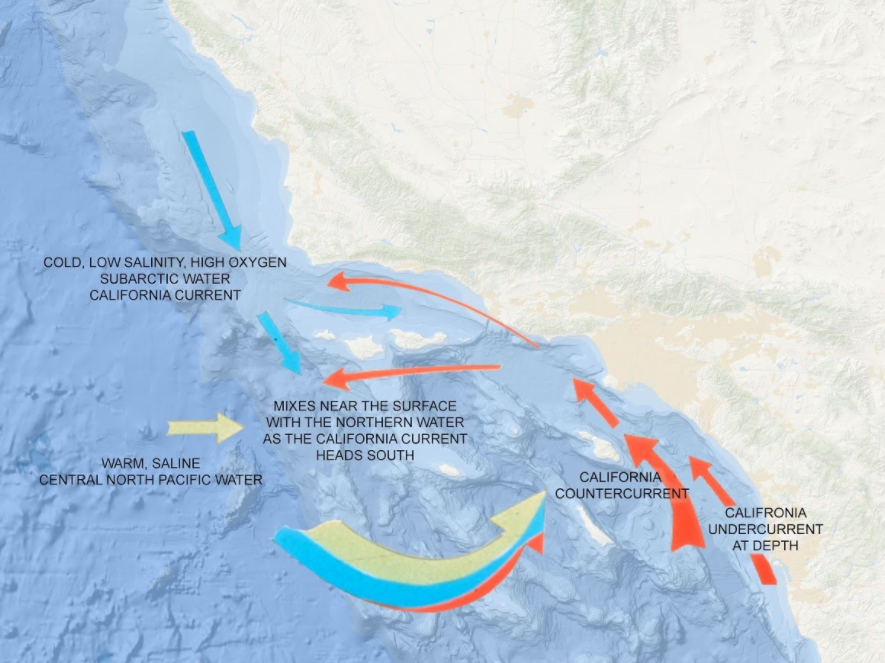
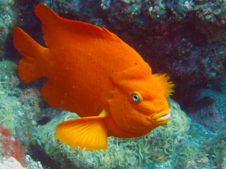
The California current brings a cold swell from the Gulf of Alaska down the coast, providing ideal temporal conditions for black rockfish, sunflower sea otters, red abalone, and other creatures around San Miguel and Santa Rosa Islands. In contrast to the southeast-bound California Current is the northwest-bound Southern California Counter-current from Baja California. This warmer and relatively nutrient-poor water supports different marine species such as spiny lobsters, moray eels, and damselfish such as California’s state fish: the Garibaldi. These species are more commonly found near the southeast islands (1: Channel Islands National Park, 2: National Park Service).
Marine Wildlife
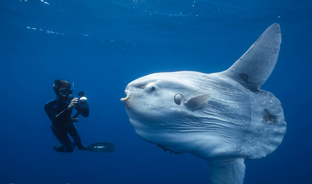
This clashing current rendezvous turns the Santa Barbara Channel into a hotspot for biodiversity for marine mammals like dolphins and whales, benthic invertebrates like purple urchins, plants such as giant kelp, and charismatic fish species such as the sunfish (the most majestic marine beast known to man).
From late November through April, whale sightings are quite common in Santa Barbara. Thousands of Pacific gray whales migrate south towards the warm waters of Baja California and feed on krill in the channel along the way, which are tiny organisms that thrive on oceanic chlorophyll blooms (4). Modern remote-sensing techniques can detect chlorophyll and sea surface temperature via satellites. In order to strategically determine the best time of year to spot these whales, we might consider the timing of these phytoplankton blooms.
Do these blooms occur more often when we have warmer ocean temperatures? What time of year would that be, and does it align with the famous “whale season” known to be November through April?
Is the ocean temperature impacted by wind?
A few data-driven friends and I decided to combine data about wind, sea surface temperature, and chlorophyll in the Santa Barbara Channel to find the best time of year to go whale watching. My collaborators include Grace Lewin, Jake Eisaguirre, and Connor Flynnfrom the Environmental Data Science program at the Bren School of Environmental Science and Management.
Primary Question: How did wind speed affect sea surface temperature and chlorophyll in the Santa Barbara Channel during 2020?
The National Oceanic Atmospheric Administration (NOAA)
Methods
The National Oceanic Atmospheric Administration has the perfect datasets to help us out, and they even have a handy application programming interface (API) to do the heavy lifting for us. The NOAA Aquamodis Satellite data can be found here.
The REDDAP API will import sea surface temperature and chlorophyll data directly from the NOAA Aquamodis Satellite. To complement this data, we manually pulled wind speed data from NOAA’s East Buoy, West Buoy, and the Santa Monica Buoy by downloading and decompressing the 2020 Standard Meteorological Data Files.
Start by loading the necessary packages for downloading the data and preparing it for analysis:
Use the rerddap API to read in the sea surface and
chlorophyll data from NOAA. Assign the respective temperature and
chlorophyll data to its respective buoy, then bind the Tidy
data together into one dataframe using rbind().
# Read in Aqua Modis Data from their website
require("rerddap")

# Sea Surface Temperature for each Buoy
E_sst <- griddap('erdMWsstd8day_LonPM180', # 8 day composite SST E_buoy
 time = c('2020-01-01T12:00:00Z','2021-01-01T12:00:00Z'), # Full year time period 2020
 latitude = c(34.0, 34.5), #grid surrounding buoy
 longitude = c(-119.5, -120), #grid surrounding buoy
 fmt = "csv")  %>%
  add_column(location = "east") #add ID column

W_sst <- griddap('erdMWsstd8day_LonPM180', # 8 day composite SST W_buoy
 time = c('2020-01-01T12:00:00Z','2021-01-01T12:00:00Z'), # Full year time period 2020
 latitude = c(34.0, 34.5), #grid surrounding buoy
 longitude = c(-120, -120.5), #grid surrounding buoy
 fmt = "csv") %>%
  add_column(location = "west") #add ID column

SM_sst <- griddap('erdMWsstd8day_LonPM180', # 8 day composite SST SM_buoy
 time = c('2020-01-01T12:00:00Z','2021-01-01T12:00:00Z'), # Full year time period 2020
 latitude = c(33.5, 34.0), #grid surrounding buoy
 longitude = c(-118.75, -119.25), #grid surrounding buoy
 fmt = "csv") %>%
  add_column(location = "SM") #add ID column

sst <- rbind(E_sst, W_sst, SM_sst) #bind data
Now for chlorophyll:
# Chloro for each Buoy
E_chloro <- griddap('erdMWchla8day_LonPM180',  # 8 day composite Chlorophyll E_buoy
  time = c('2020-01-01T12:00:00Z','2021-01-01T12:00:00Z'), # Full year time period 2020
  latitude = c(34.0, 34.5), #grid surrounding buoy
  longitude = c(-119.5, -120), #grid surrounding buoy
  fmt = "csv") %>%
  add_column(location = "east") #add location term

W_chloro <- griddap('erdMWchla8day_LonPM180', # 8 day composite Chlorophyll E_buoy
  time = c('2020-01-01T12:00:00Z','2021-01-01T12:00:00Z'), # Full year time period 2020
  latitude = c(34.0, 34.5), #grid surrounding buoy
  longitude = c(-120, -120.5), #grid surrounding buoy
  fmt = "csv") %>%
  add_column(location = "west") #add location term

SM_chloro <- griddap('erdMWchla8day_LonPM180', # 8 day composite Chlorophyll SM_buoy
  time = c('2020-01-01T12:00:00Z','2021-01-01T12:00:00Z'), # Full year time period 2020
  latitude = c(33.5, 34.0), #grid surrounding buoy
  longitude = c(-118.75, -119.25), #grid surrounding buoy
  fmt = "csv")%>%
  add_column(location = "SM") #add location term

chloro <- rbind(E_chloro, W_chloro, SM_chloro) #Bind data
We downlaoded the wind data manually from NOAA’s
website, so we import it from the local Rproj, using
the here() function. This file path will work on your local
machine, helping make this log post as reproducible as possible.
# Wind data for each buoy and data cleaning
tab_E <- read.table(here("data","east_wind.txt"), comment="", header=TRUE) #convert .txt file to .csv
write.csv(tab_E, "east_wind.csv", row.names=F, quote=F)

E_wind <- read.csv(here("east_wind.csv")) %>% # read in .csv, select columns and rename
  add_column(location = "east") %>%
  select(c("X.YY", "MM", "DD", "WSPD", "location"))  %>%
  rename(year = X.YY,
         month = MM,
         day = DD)
E_wind <- E_wind[-c(1),]


tab_W <- read.table(here("data","west_wind.txt"), comment="", header=TRUE) #convert .txt file to .csv
write.csv(tab_W, "west_wind.csv", row.names=F, quote=F)

W_wind <- read.csv(here("west_wind.csv"))%>% # read in .csv, select coloumns and rename
  add_column(location = "west") %>%
  select(c("X.YY", "MM", "DD", "WSPD", "location"))  %>%
  rename(year = X.YY,
         month = MM,
         day = DD)
W_wind <- W_wind[-c(1),]


tab_SM <- read.table(here("data","SM_wind.txt"), comment="", header=TRUE) #convert .txt file to .csv
write.csv(tab_SM, "SM_wind.csv", row.names=F, quote=F)

SM_wind <- read.csv(here("SM_wind.csv"))%>% # read in .csv, select coloumns and rename
  add_column(location = "SM") %>%
  select(c("X.YY", "MM", "DD", "WSPD", "location"))  %>%
  rename(year = X.YY,
         month = MM,
         day = DD)
SM_wind <- SM_wind[-c(1),]

wind <- rbind(E_wind, W_wind, SM_wind) #bind data
My team averaged the wind by month rather than by day because the wind varies more each day by a large margin. Therefore, the wind data on a daily basis shows lots of noise and no interpretable trends. On a monthly scale, however, we can make sense of its broader fluctuations over the year.
# clean date format and summarize with daily means for wind
wind <- wind %>%
  unite("date", year:month:day, sep = "-") %>%
  mutate(date = ymd(date, tz = NULL)) %>%
  mutate(WSPD = as.numeric(WSPD))

# see the data join chunk for na.rm explanation in code comment
wind_avg <- wind %>%
  group_by(location, date) %>%
  summarize(mean_wind = mean(WSPD, na.rm = T))
Here we cleaned the remotely-sensed sea surface temperature data, summarizing it by day:
# clean data for sst date
sst_clean <- sst %>%
  mutate(date = ymd_hms(time, tz = "UTC")) %>%
  mutate(ymd_date = ymd(date, tz = NULL)) %>%
  mutate(date = ymd_date) %>%
  select(c("latitude", "longitude", "sst", "location", "date"))

# Clean sst Data and summarize by daily means
final_sst <- sst_clean %>%
  filter(sst > 0) %>% # remove NAs
  mutate(sst = (sst * (9/5) + 32 )) %>% # convert to F...there's probably a function for this
  mutate(sst = (sst - 3)) # accounting for SST satellite error through anecdotal and buoy comparison.
# A team member's field experience justifies this as he has consistently cross-referenced the satellite data with in situ measurements

# see the data join chunk for na.rm explanation in code comment
final_sst_avg <- final_sst %>%
  group_by(location, date) %>%
  summarize(mean_sst = mean(sst, na.rm = T))
Here we cleaned the remotely-sensed chlorophyll data, summarizing it by day:
# clean chloro data
# see the data join chunk for na.rm explanation in code comment
chloro_clean <- chloro %>%
  mutate(date = ymd_hms(time, tz = "UTC")) %>%  # never forget to check the timezone!
  mutate(ymd_date = ymd(date, tz = NULL)) %>%
  mutate(date = ymd_date) %>%
  select(c("latitude", "longitude", "chlorophyll", "location", "date"))

final_chloro_avg <- chloro_clean %>%
  group_by(location, date) %>%
  summarize(mean_chloro = mean(chlorophyll, na.rm = T))
We used inner_join() in two steps to combine the cleaned
data from the three variables into one dataframe:
# combine daily wind and sst and chloro means
# we decided to use inner join in order to not include any rows that lack values for ANY of the 3 variables.
# We do not want any NA values in one col and have data in another col, because when we map everything together
# that data would be represented as if there was a zero value for the variable that had NA.
# his change reduced the amount of rows by a couple hundred. This was primarily in the SST and cholorophyll data
# which had plenty of NA's but the wind data did not initially have NA's.

wind_sst <- inner_join(wind_avg, final_sst_avg, by = c("date", "location"))

chloro_wind_sst <- inner_join(wind_sst, final_chloro_avg, by = c("date", "location"))
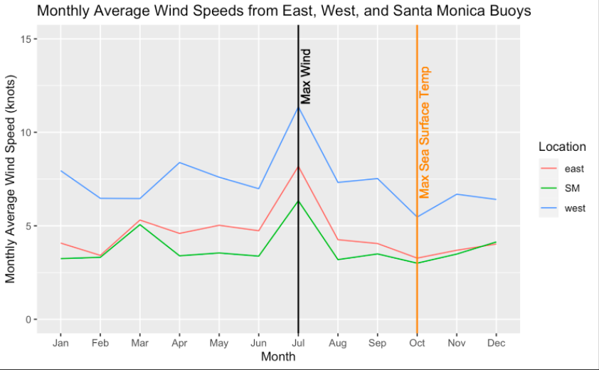
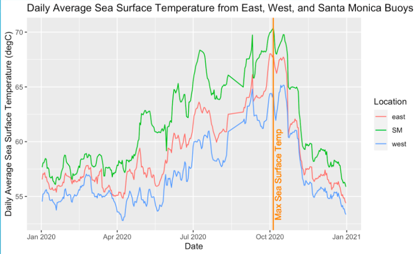
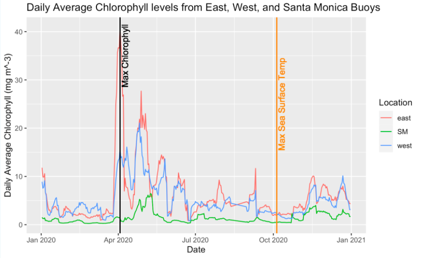
Now the fun part: visualization! My team and I made three plots, one for each variable. Each plot represents data from all three buoys. We marked the sea surface temperature maximum in all plots since the combined data reveals a probable temporal correlation between sea surface temperature and wind.
# Daily Average Sea Surface Temperature from East, West, and Santa Monica Buoys
ggplot(data = chloro_wind_sst, aes(x = date, y = mean_sst, color = location)) +
  geom_line() +
  labs(x = "Date",
       y = "Daily Average Sea Surface Temperature (degC)",
       title = "Daily Average Sea Surface Temperature from East, West, and Santa Monica Buoys",
       color = "Location")

# Monthly Average Wind from East, West, and Santa Monica Buoys
month_mean <- chloro_wind_sst %>%
  select(location, date, mean_wind) %>%
  mutate(month = month(date, label = TRUE)) %>%
  mutate(month = as.numeric(month)) %>%
  group_by(location, month) %>%
  summarize(mean_wind = mean(mean_wind, na.rm = T))

ggplot(data = month_mean, aes(x = month, y = mean_wind, color = location)) +
  geom_line() +
  labs(x = "Month",
       y = "Monthly Average Wind Speed (knots)",
       title = "Monthly Average Wind Speeds from East, West, and Santa Monica Buoys",
       color = "Location") +
  ylim(0,15) +
  scale_x_discrete(limits=month.abb)

# Daily Average Chorophyll from East, West, and Santa Monica Buoys
ggplot(data = chloro_wind_sst, aes(x = date, y = mean_chloro, color = location)) +
  geom_line() +
  labs(x = "Date",
       y = "Daily Average Chlorophyll (mg m^-3)",
       title = "Daily Average Chlorophyll levels from East, West, and Santa Monica Buoys",
       color = "Location")
Interpretation
In the Santa Barbara Channel, the wind peaks in July. This aligns with low chlorophyll levels and about average sea surface temperature.
The sea surface temperature peaked in October. This somewhat aligns with the start of the well-known whale watching season that spans from November to April. The whales are following warm water and food, after all!
The chlorophyll peaked in April. This aligns with the well-known whale watching season that spans from November to April. The data shows that we would have the best luck whale watching in Santa Barbara in April.
Acknowledgements
- I would like to thank my exceptionally driven and creative team of
collaborators on this project, Grace Lewin, Jake Eisaguirre, and Connor
Flynn, good friends of mine from the Environmental Data Science program
at the Bren School of Environmental Science and Management. Thank you
for your time, resources, and all the energy you put into this code and
analysis.
- Thank you to Julien Brun, a Senior Data Scientist at the National Center for Ecological
Analysis and Synthesis, for teaching us about how to use API’s as
wel as locate and utilize metadata. We admire Julien for his dedication
to open-source science and instilling reproducible habits in the next
generation of scientists.
- Thank you to NOAA for providing the data that made this analysis possible and for providing an API to import it with ease.
References
- Channel
Islands National Park
- National
Park Service
- Ocean
Sunfish
- Santa
Barbara: The American Riveria
- NOAA
Aquamodis Satellite