
Let’s map the critical habitat ranges of the Florida Bonneted bat and many other species of concern.
In this tutorial, we learn the basics of plotting shapefiles overlaid on top of a basemap. Understanding where points, lines, and polygons exist in the world allows us to answer questions about correlated variables, consider new questions that arise throughout the analysis process, and communicate conclusions to audiences in an easily-digestible way.
We start with the basics; installing the integrated development environment (IDE) such as VS Code or Jupyter Notebook and installing the necessary packages.
I’m interested in plotting endangered species’ critical habitat ranges throughout the United States. I sourced my data from the U.S. Geological Survey here. I’m a big fan of USGS datasets because they are relatively clean and provide comprehensive metadata.
Getting started
Firstly, install Anaconda with instructions from
Conda documentation or from this blog post
that worked well for me. To minimize the packages you’re installing,
install miniconda. This can be done through the
commandline. Both Anaconda or Miniconda will
work whether you have a PC or Mac.
Next, install the IDE VSCode. I recommend this over Jupyter Notebooks.
Don’t install any packages into your base environment. If you do this by accident, you can always reset it.
On a Mac, I activate conda in the regular terminal
(conda activate). On a PC, I do this from the Anaconda
Prompt (the Anaconda terminal) because it’s tricky to get
my normal command line or Bash to recognize that conda is
indeed on my computer.
Create a new conda environment with
conda create -n EnvName and tag on python=3.10
to the end if you want to specify a certain python version. Activate the
environment with conda activate EnvName.
Install geopandas with
conda install geopandas or
pip install geopandas.
If using Jupyter Notebooks: in the command line, navigate to the
folder in my terminal in which I want to open and save my Jupyter
Notebook. That command is cd file/path/to/folder. You know
this worked if your terminal working directory now has that file path
tacked onto the end. This file path step is not required if you
want to include relative file paths to import data and save
your notebook.
- Download your spatial data files to this folder to make your life
easier when you import your spatial data.
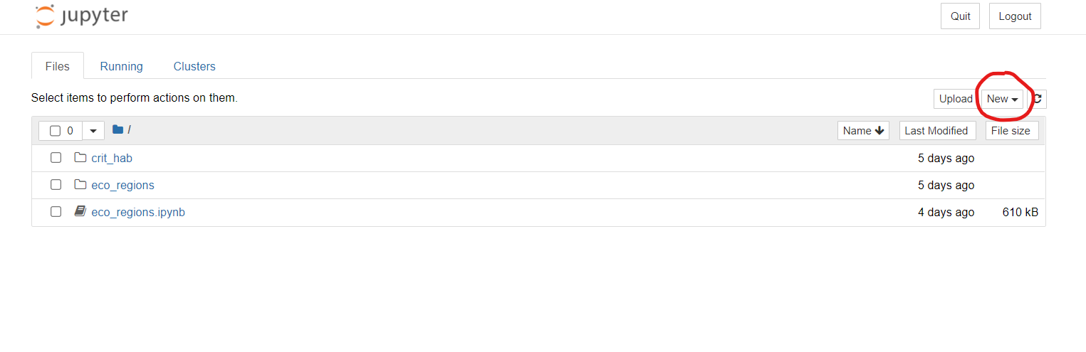
- If using Jupyter Notebooks, open a new one by running:
jupyter notebook. This will pop open Jupyter Notebook in your browser with your folder of choice already open and ready to go. In the upper right side, open a new notebook. If using VScode, run:touch spatial_analysis.ipynb
- Note: the Anaconda terminal window you used to open this notebook
should not be closed during your work session. It must remain open to
keep your kernel connected and give you the ability to save! If you need
to run any terminal commands after you have already opened this
notebook, such as if you need to download a package or check a file
location, just open up another terminal window and enter the
geo_envenvironment to do so.
Importing Packages
For plotting shapefiles, you’ll want to import the following packages:
import pandas as pd
import numpy as np
import geopandas as gpd
import matplotlib.pyplot as plt # plot our data and manipulate the plot
import contextily as ctx # add a default basemap under our polygons of interest
If you do not already have contextily installed, use a
conda forge command to install it in the terminal in your
environment if you used conda forge to install previous
packages. If you used pip to install other packages, stick with
pip. It is not wise to mix conda forge and
pip in the same environment because dependencies can
conflict.
I like to include a markdown chunk following my package imports that includes a URL link to where I found my data, a citation, and notes about how I downloaded it for myself or anyone else working through my code:
Data source: [US Fish and Wildlife](https://ecos.fws.gov/ecp/report/table/critical-habitat.html)\
- contains .shp, .dbf, and .shx polygon files that relate to critical species habiata in the United States\
- I chose the first zip file you see on this site
Importing Data
We will use geopandas to read in the
shapefile with polygons or lines or points You might
take a look at all the file extensions and feel overwhelmed. Shapefiles
and their metadata are stored separately (.shp, .dbf, .shx, .xml, and so
on). In this example we are trying to import a
shapefile of polygons, so that .shp
file is the only one you need to read in:
gdf = gpd.read_file('CRITHAB_POLY.shp')By simply typing gdf, we get a nicely formatted preview
of the geodataframe:
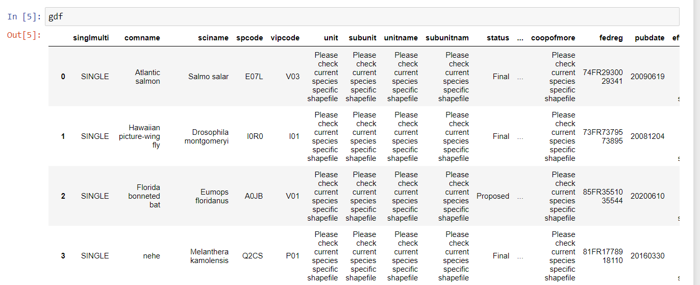
This shapefile contains polygons that designate the critical habitat ranges for many endangered and threatened species in the United States.
Practice simple commands like calling all the column names in the dataframe:
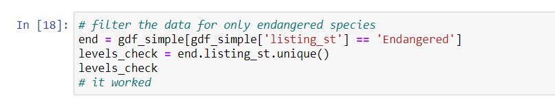
print(gdf.columns)Check the factor levels for the columns listing_st:
status_levels = gdf.listing_st.unique()
status_levels
Using U.S. Fish and Wildlife as an example, now that you know the factor levels of a categorical variable, you can subset for only “endangered” species, only “threatened” species, etc.
Play around with your dataframe a bit; Google some of the species,
subset the columns, search for NA values, or take the
average of a column. After you make a structural change, its a good
habit to check the status or dimensions of your dataframe.
Check the number of rows and columns: 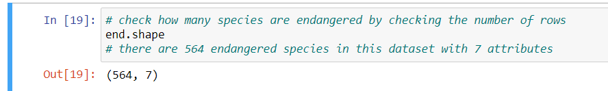
Print the latitude and longitude pairs that make up a particular
polygon: 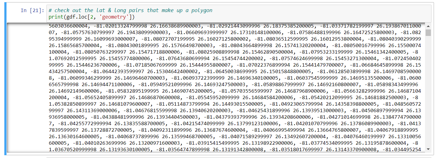
Setting the Coordinate Reference System
As a last step before you plot, you have to make sure you set and then transform the data to the desired coordinate reference system (CRS). This is standard for all kinds of spatial data, since your data might come with an undesired CRS or lack information about it. For information about coordinate reference systems, check out this guide.
Three common CRS’s are as follows:
WGS84 (EPSG: 4326), which is commonly used for GIS data across the globe or across multiple countries
NAD83 (EPSG:4269), which is most commonly used for federal agencies
Mercator (EPSG: 3857), which is projected, uses units of meters, and used for tiles from Google Maps, Open Street Maps, and Stamen Maps. I will use this one today because I want to overlay my polygons onto a Google basemap with
contextily.
Once you set the CRS, transform it:
gdf_3857 = to_crs(epsg = "3857", inplace = False)Plotting Shapefiles on a Basemap
Use the plot() function from matplotlib and
assign the palette to the species attribute:
gdf_3857.plot(column = 'comname',
             figsize = 20,20))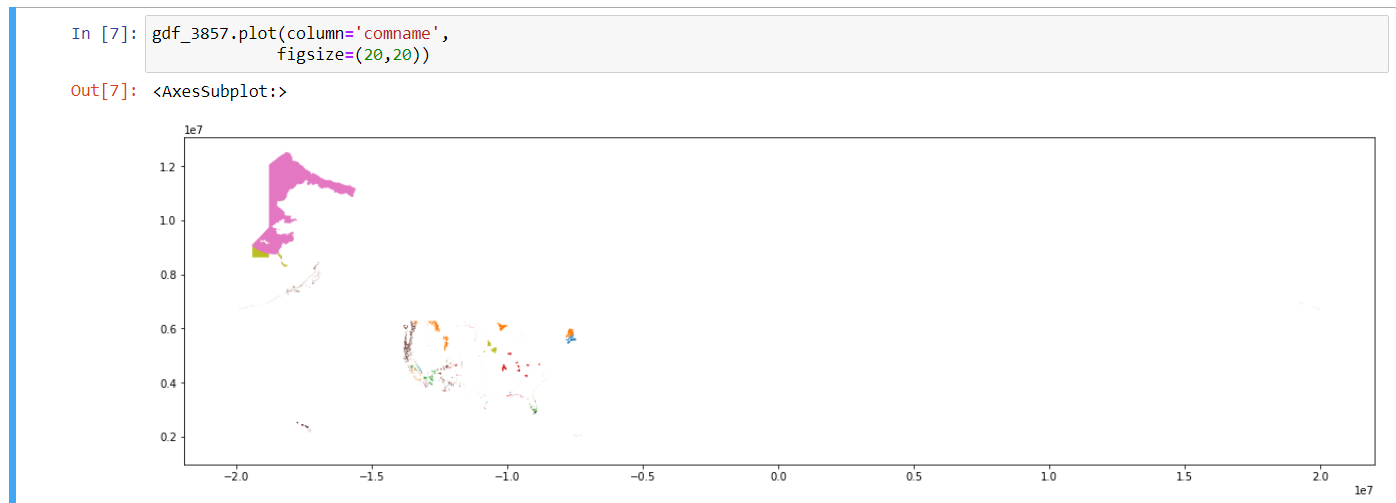
Note that you did not have to call the package to use the function
plot(). Instead, you can name the dataframe which you want
to plot, which is gdf_3857 in this case, then
plot() and add arguments and supplemental plot structure
changes as you go.
The figsize can be whatever you want. You have finer
control over the degree of zoom of the map with the arguments
xlim() and ylim(). These polygons are just
floating in space, so lets add a basemap to give us geographical
context:
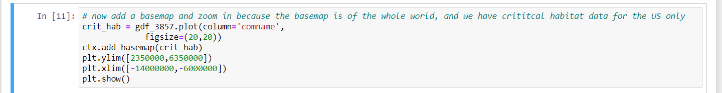
crit_hab_polys = gdf_3857.plot(column = 'comname',
                              figsize = (20,20))
Notice that I used an argument in the plot function, setting the
column = 'comname', which specifies the common name for the
species in that row. This argument sets a unique color to each common
name, which will help us tell the difference between each species’
habitat on the map, even if 1 species’ habitat is composed of multiple
polygons.
ctx.add_basemap(crit_hab_polys)

# Set the axis limits to zoom in on just the lower 48 states
plt.ylim([2350000,6350000])
Since the extent of the basemap within the contextily
package is the entire world, we need to specify the x-limitations and
y-limitations for our map so we can zoom in on the United States. The
default x and y units were in the millions, so I specified my units in
millions, too. When considering if I should plug in positive or negative
values, I considered the way that coordinate reference systems are
designed with positive values for North and East, and negative values
for South and West. I considered that the United States is north of the
equator, so I should have positive values for the min and max y. As for
the magnitude of my values, I simply looked at the map for a starting
point and played around with different numbers until I got the view I
wanted.
plt.xlim([-14000000,-6000000])Notice that these values are negative. Along similar thinking to how
we decided on our y limitation, these negative values are the result of
how coordinate systems are designed. Consider the prime meridian (which
lies at 0 degrees in the East and West directions) with West being
negative. Since the United States are to the West of the prime meridian,
we know that the x-range for our zoom should be negative. As for the
magnitude, I just played around with the numbers until I got the
East-West orientation that encompassed the United States. Use the
show() function in matplotlib to tell Python
to show the most recently created graph:
plt.show()
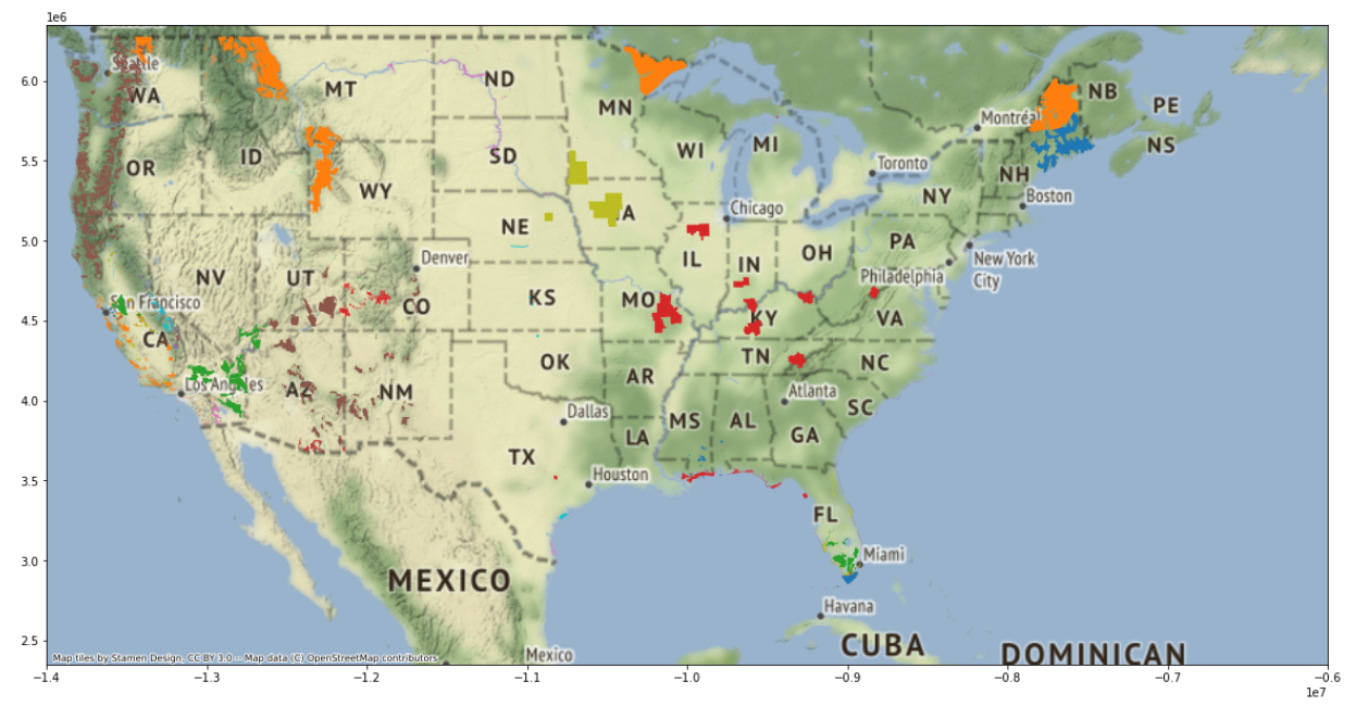
You did it! Welcome to the wonderful world of geospatial data in Python.
Future Analysis
With this basic skill mastered, you can now dive deeper into this data to determine if variables are correlated across space. Considering state borders, you might ask which endangered species occupy critical habitat in your home state? and investigate the different wildlife protection policies across the United States. Alternatively, you could approach this data from an environmental perspective and ask which natural biomes contain the most critical habitat for these endangered species? Are these habitats degrading at a faster rate than those that contain less critical habitat?
A Local California Use Case Example
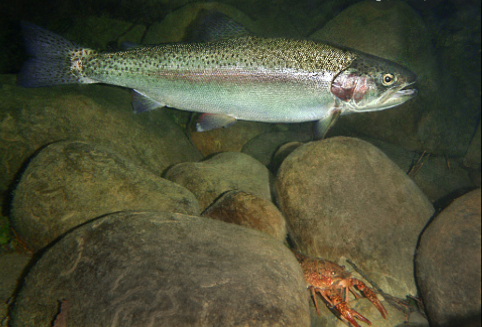
Living in Santa Barbara, I’m interested in the critical habitat of the Southern California Steelhead Trout. Steelhead trout is a beautiful fish species that interbreeds with resident rainbow trout in many coastal regions throughout California, which are split into distinct population segments:
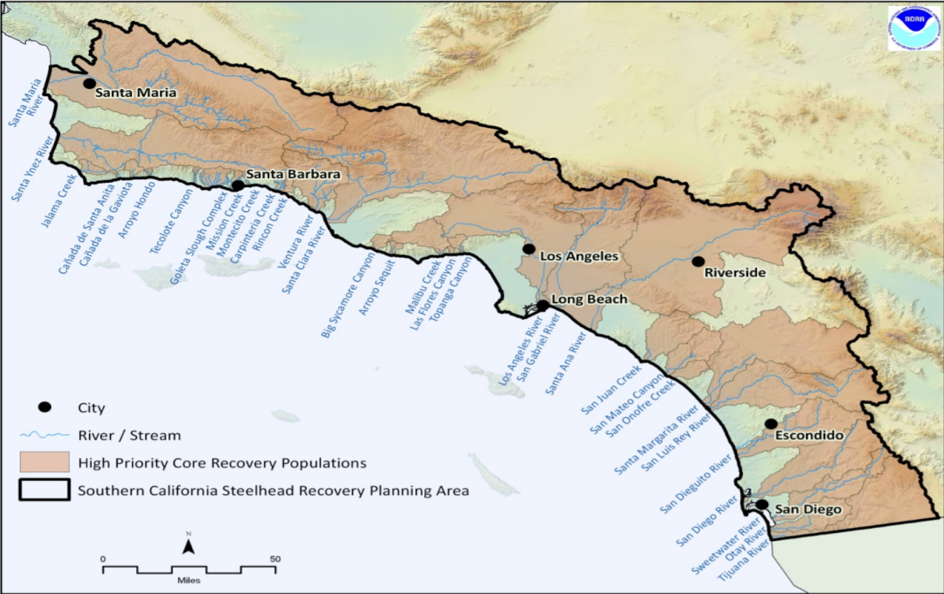
I was lucky enough to conduct field work with these migratory fish with the Pacific States Marine Fisheries Committee. I grew to appreciate their role in ecosystem processes and the culture of indigenous people. This fish has been on the federal endangered species list for years, but was just recently listed as a California endangered species in 2024. This will hopefully expand critical habitat range, increase monitoring of the populations, and help enforce illegal fishing and pollution regulation in their habitat. We can check out the steelhead’s critical habitat range before and after 2024 to see how it expands over time and space.
Sources & supplemental information on listed endangered species in the United States:
- Florida
bonneted bat photo
- U.S.
Fish and Wildlife data
- U.S. Fish and Wildlife’s
Environmental Conservation Online system
- U.S.
Fish and Wildlife listed wildlife species
- this includes links for data on each each species and a map of their
habitat
- Southern California Steelhead Trout
- Southern California Steelhead Trout distinct population segement map
- Southern California Steelhead Trout
- Python logo